- Create
- Community
- Blog
- About

The Ultimate Summer Guide for Color: Blues, Neutrals, and Pops
 by DecorMatters|Jul 29, 2021
One of the most well-documented mood-altering design elements is color. You’ve almost certainly heard people refer to reds, yellows, and oranges as “warm” colors, and greens, blues, and purples are “cool.” These categorizations are not a coincidence – our modern psychological understanding of color dates back to the 1800s and Johann Wolfgang von Goethe’s Theory of Colours.


📸@anthology_creative_studio, @marieolssonnylander
When we are in rooms that feature ardent colors, we feel physically warmer, and cool colors make us feel colder. Perhaps that’s why blues, turquoise, and teals are more popular in warm weather. But what else should you know to master your color palette this summer? We’re about to tell you.
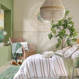
Bring on the Blues
There are endless shades of blue and aqua, and they have become particularly trendy this year. As well as transmitting calming energy, azure shades remind homeowners of the ocean with sandy beaches and bright summer skies that they haven’t been able to see this year.

Coastal styling is about keeping things light and breezy. In the bedroom, try barely-there blue linen, or a blue velvet sloped armchair paired with a crisp white backdrop to give your space an immediate revamp. It could scream Grecian vibes or lean towards nautical.
In the bathroom, invest in some marine blue scalloped fish scale tiles to fill in that abandoned, plain shower wall with only a caddie for decoration. They’ll glimmer as you bathe in the morning, showering you with positivity and radiance.


📸@megangorelickinteriors, @interior_designer.uk
The ancient practice of Feng Shui celebrates shapes and textures that represent the natural elements of earth, water, and fire. If you’ve already painted some accent walls in your living room and kitchen with rich blues that don’t stain easily, go further with the beachy theme by introducing natural materials. Don’t be afraid to be bold with distressed woods which complement blue elegantly.

📸@mycreativeitch, @kseniamyasnikova
If you want an all-encompassing blue effect, incorporating mirrors and reflective surfaces does the trick. And if your coastal interior is lacking in natural light, consider hanging a mirror opposite a window, or even a porthole!

Pops of Color
If you want to incorporate pops of color into your decor at any given point, it’s straightforward. All you have to do is switch out accents like blankets, rugs, and vases as your tastes evolve. Pops of color are always a popular interior design trend but, for summer 2021, they are getting smaller due to our obsession with miniature objects, which triggers dopamine release in our brains.

Think wallpaper banners, lampshades, or cushions with bright, intricate patterns or contrasting bold-colored chair legs. Additionally, showcase color through bold art prints on walls or mix and match textures and patterns – but don’t overwhelm the room.


📸 @mrsjoyclary, @therathproject
If you're a minimalist at heart, pops of bright cobalt blue can bring an air of vibrancy to an all-white room. Incorporate these hues into your decor as a constant reminder of better days, clear skies, and sun-kissed skin.
Neutrals Are Never Dull
Adding pops of color is a quintessential way of bringing the feeling of summer into a home, but a soft and neutral space can evoke a light and airy feeling too. White, ivory, pale gray, and beige are all colors associated with summer beach homes in The Hamptons and ooze luxury and well-being.


📸@jnaydaily, @ourlakeviewhaven
After years of living in a 'throw away society', at DecorMatters we love celebrating a 'less is more' approach. White couches and gauzy drapes never go out of style, and shades of gray and beige work exceptionally well for bedroom decor on long-lasting headboards or nightstands. Adopting a neutral color palette gives you excellent backdrops for whatever color scheme you want to switch over to as time goes by too.

One of the simplest and budget-friendly ways to adopt this neutral style is to convert your current furniture to white wood with paint. If you’d prefer darker furniture, white throws and pillows on sofas, chairs, and beds will brighten up your space.
Don’t forget brass, bronze, ceramics, leather, and stone accessories to add a little texture while maintaining the natural materials and neutral tones.


📸 @diariesofmyhome, @posterstore
Embracing color doesn’t mean splashing random shades across your home. It means carefully curating a color palette and incorporating it smartly into your home to create a cohesive interior design scheme.
Want to know more about how the color of your interior design affects your day-to-day life? Check out our color blogs and series.


Socialize


 21h left